

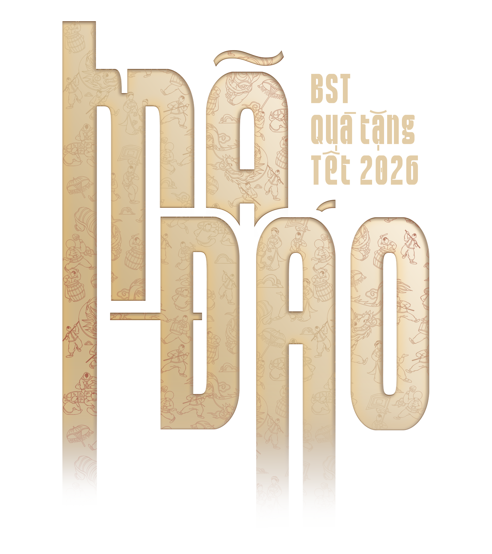
LUNAR NEW YEAR COLLECTION 2026
For Tết, KIEN unveils the Mã Đáo Collection, a tribute to the timeless blessing “Mã đáo thành công”, where success arrives with unstoppable momentum. Inspired by the spirit of the galloping horse, swift, resolute, and victorious, the collection captures the energy of new beginnings and bold ambition. Through refined craftsmanship and deliberate design, Mã Đáo becomes more than a Tết gift. It is a symbol of forward motion, a celebration of triumph, and a statement of confidence for the year ahead.

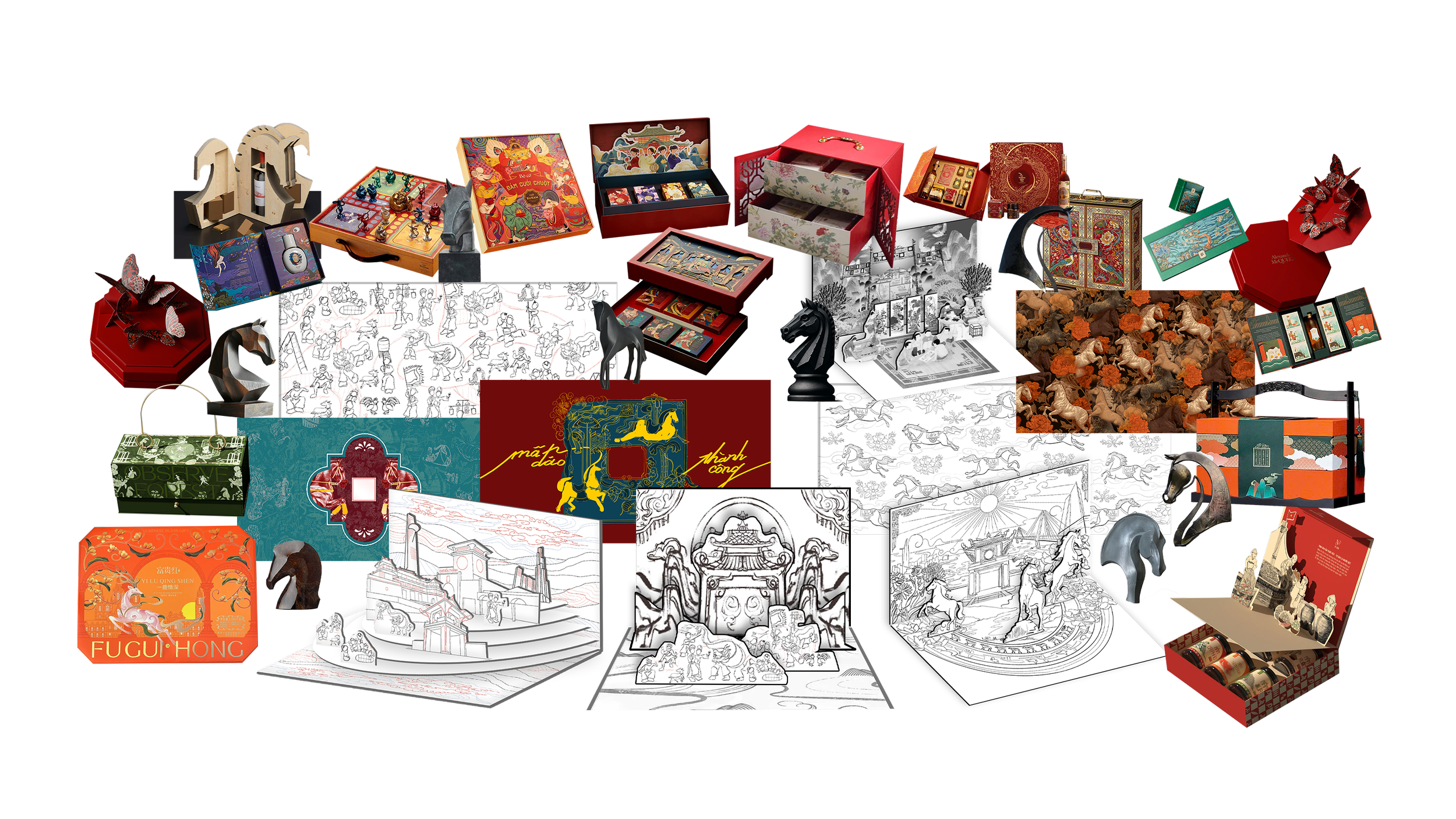
CREATIVE APPROOACH
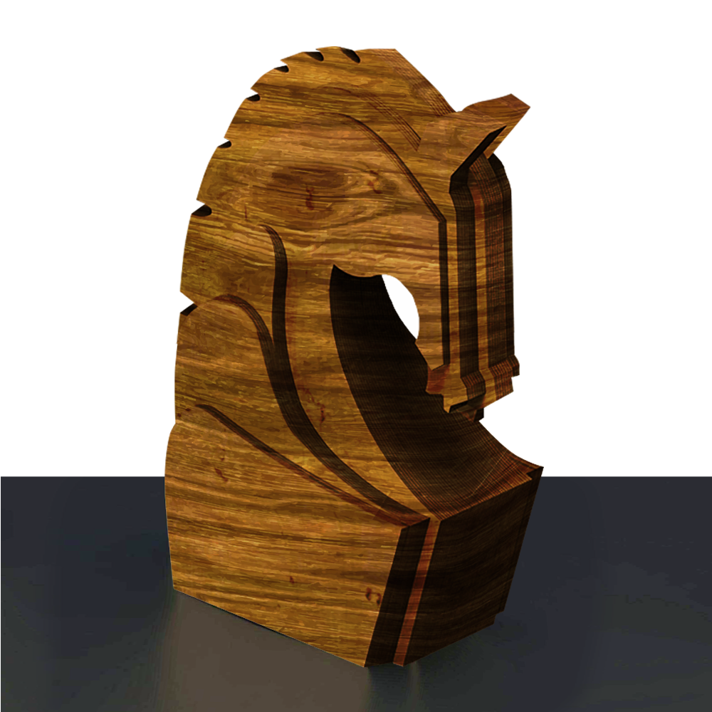
The creative approach began by reinterpreting Mã đáo thành công beyond a literal horse motif, focusing instead on its deeper meaning of momentum, triumph, and strategic ambition. Research moved across three territories: symbolism through sculpture and chess iconography, ritual and folklore drawn from temple architecture and festive traditions, and craft through paper engineering and structural exploration This layered process shaped a cohesive design system where form, material, and storytelling embody the forward motion and victorious spirit of Mã Đáo.
Ornamental Prestige
Gold detailing, structured symmetry, royal red tones, emblematic framing
→ Became Mã Đáo Thành Công
Narrative Pop Up Storytelling
Folk illustration, temple architecture, festive procession, layered paper engineering
→ Became Mã Đáo Đại Phúc
Đông Dương Heritage
Blossom painting, subtle texture, restrained palette, quiet luxury finishes
→ Became Mã Đáo Cát Tường
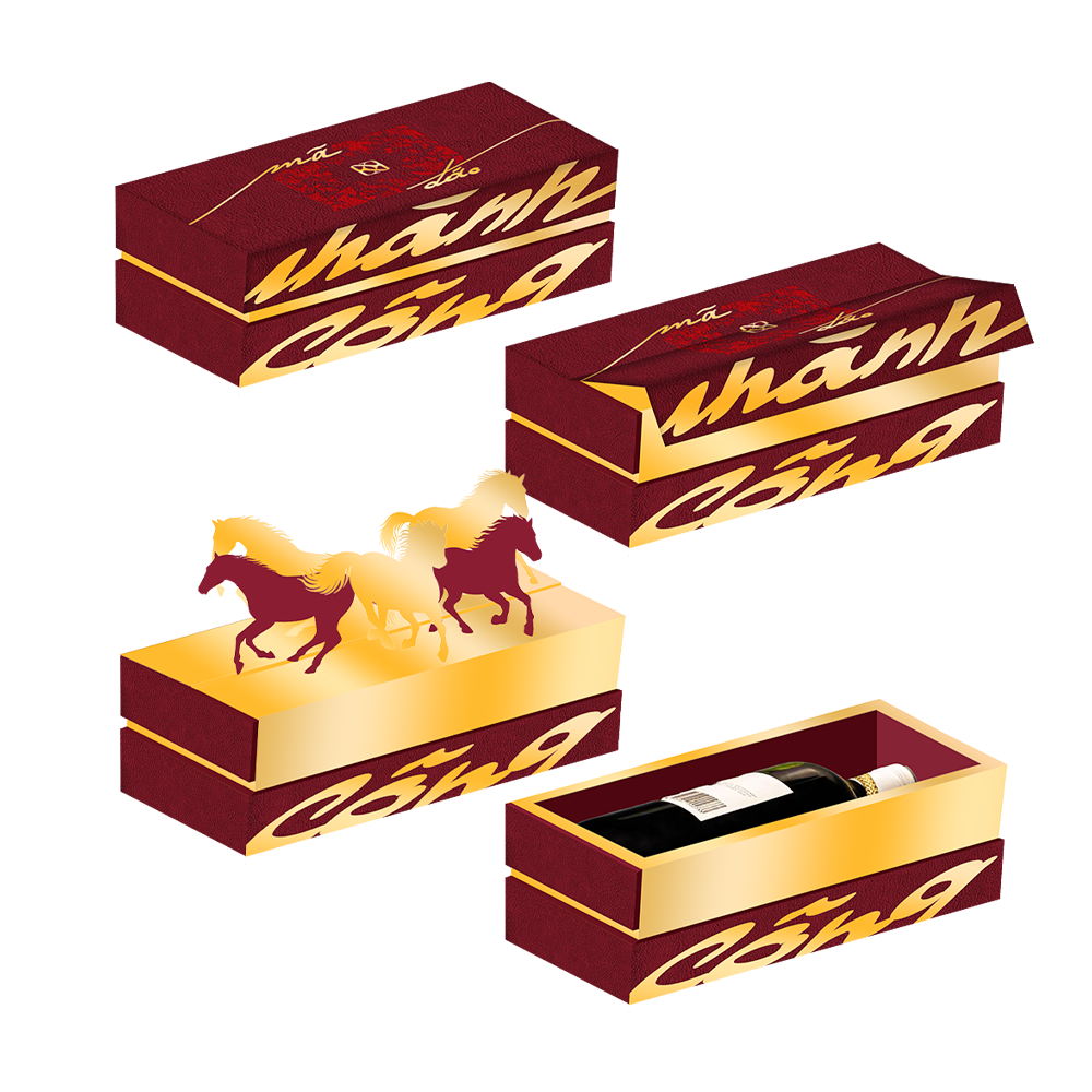

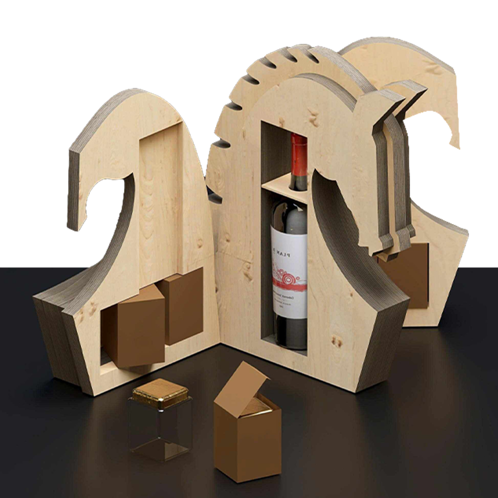
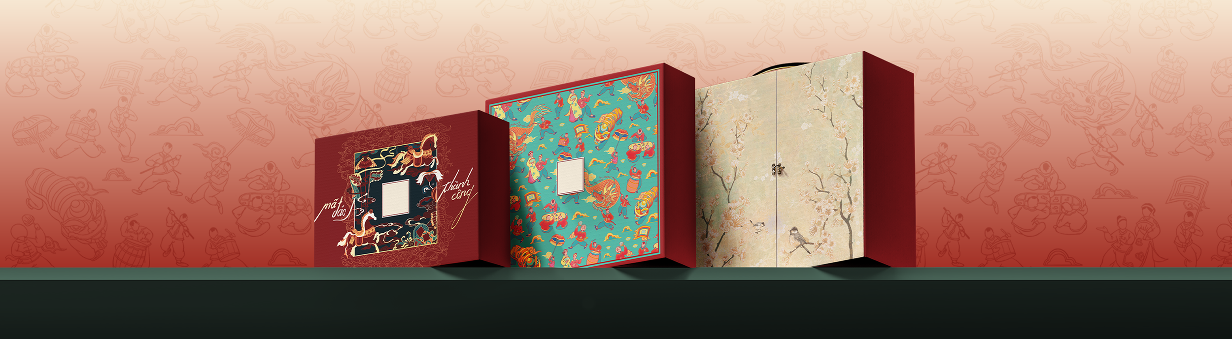
DEMO PACKAGES

THE DESIGNS
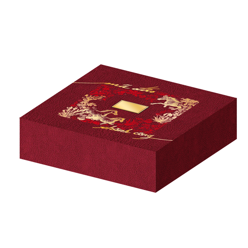
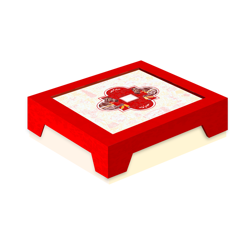
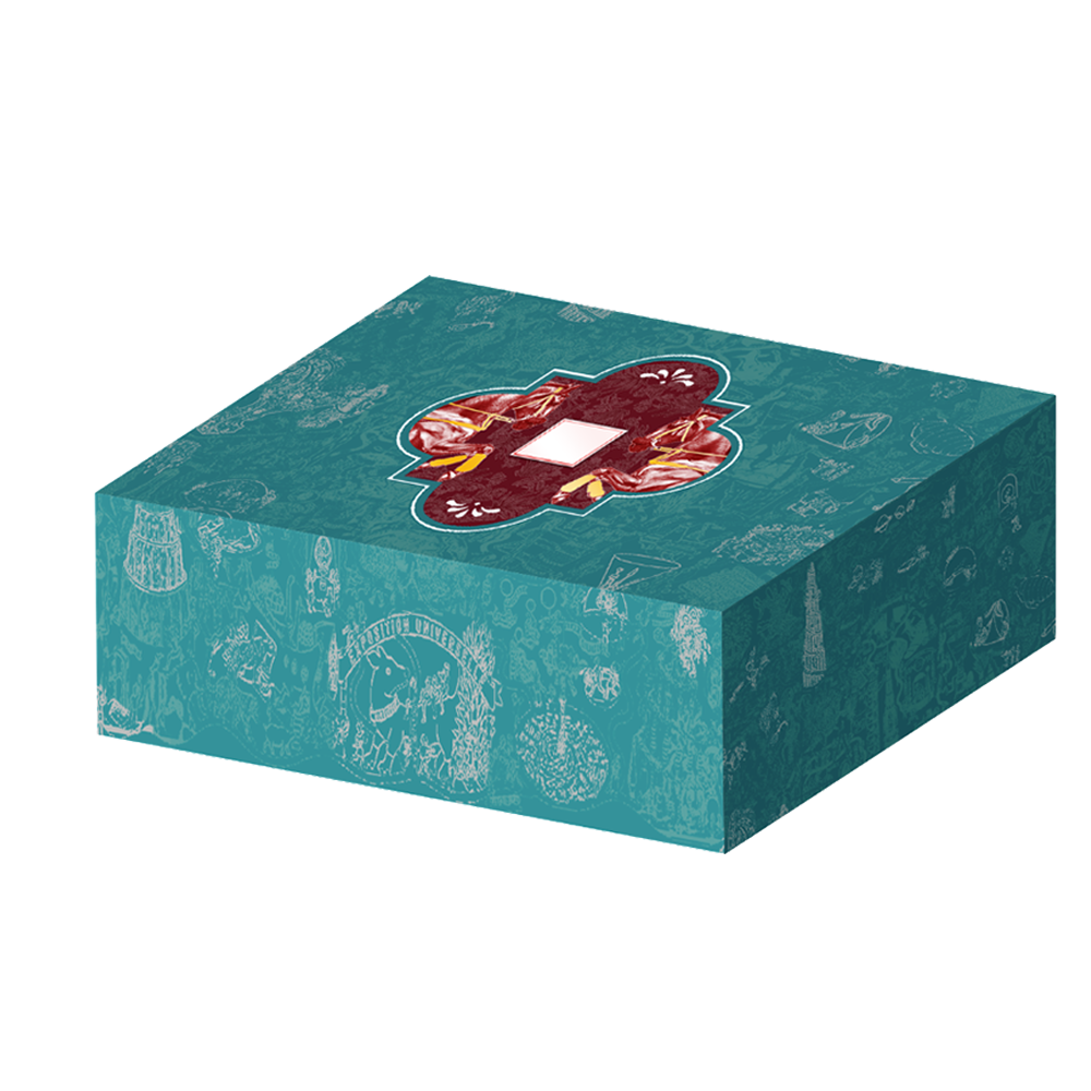
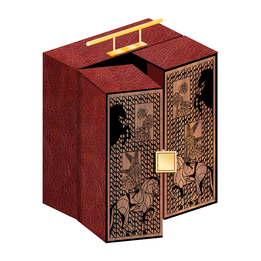
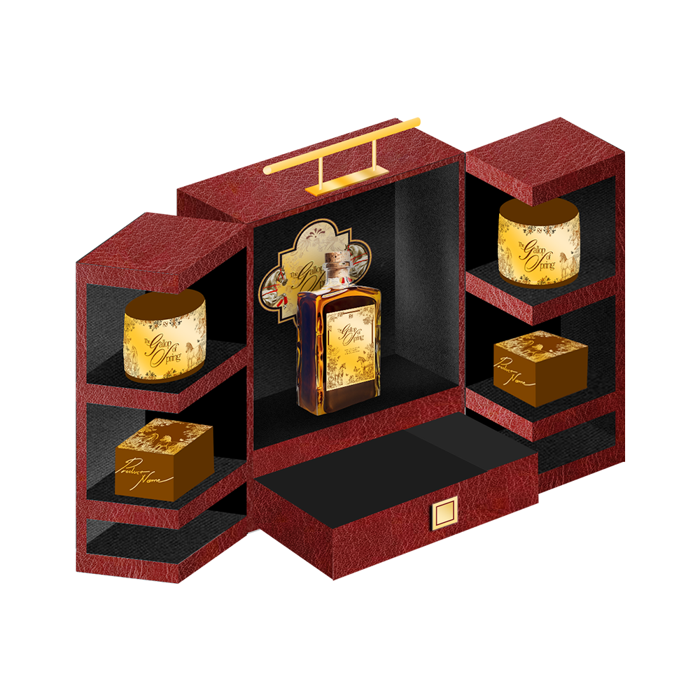
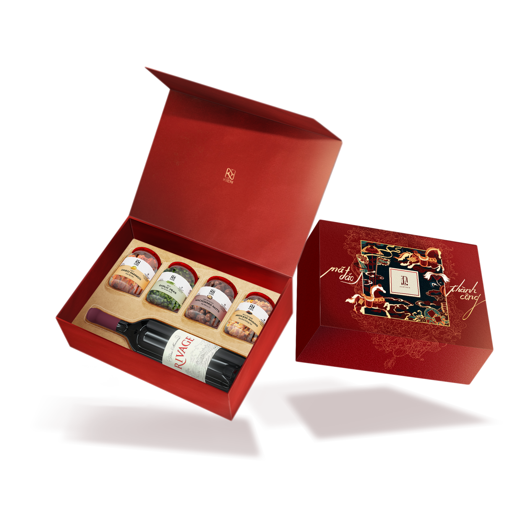
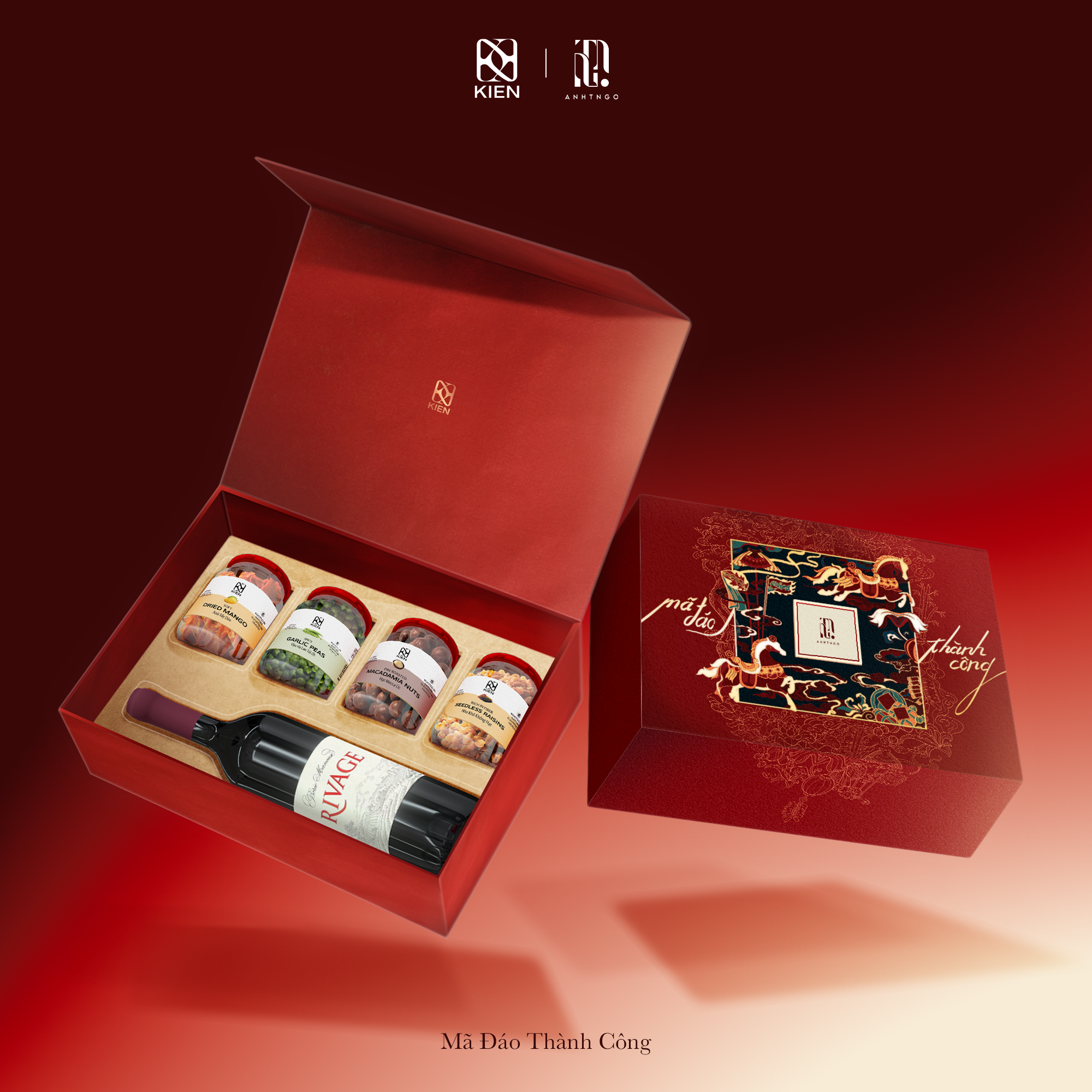
Mã Đáo Thành Công
Mã Đáo Thành Công represents the most ceremonial expression of the collection. Inspired by the spirit of swift victory, the design emphasizes symmetry, royal red tones, and refined gold detailing to convey strength and authority.
Rather than depicting the horse literally, its energy is translated through structured composition and elevated finishes, positioning the package as a statement of confidence and achieved success.
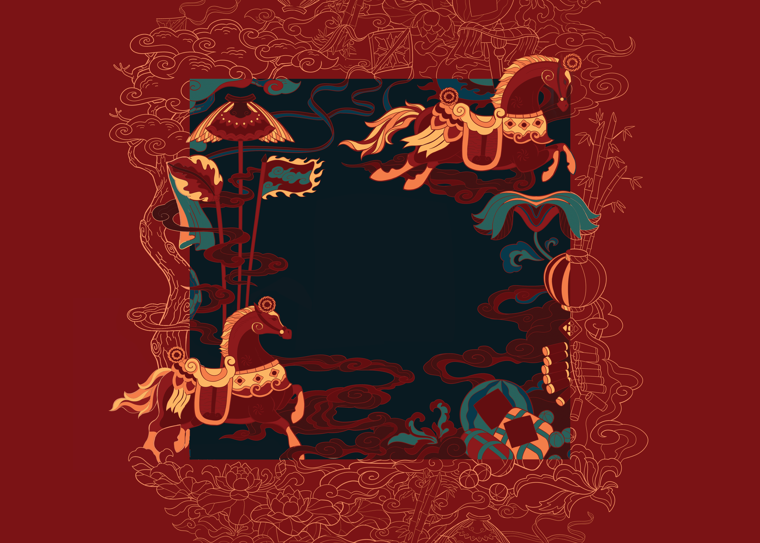
Effect after printing
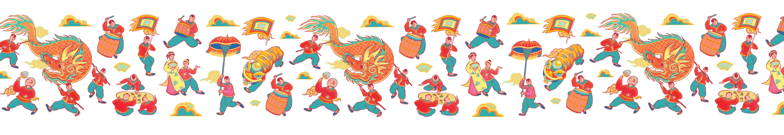
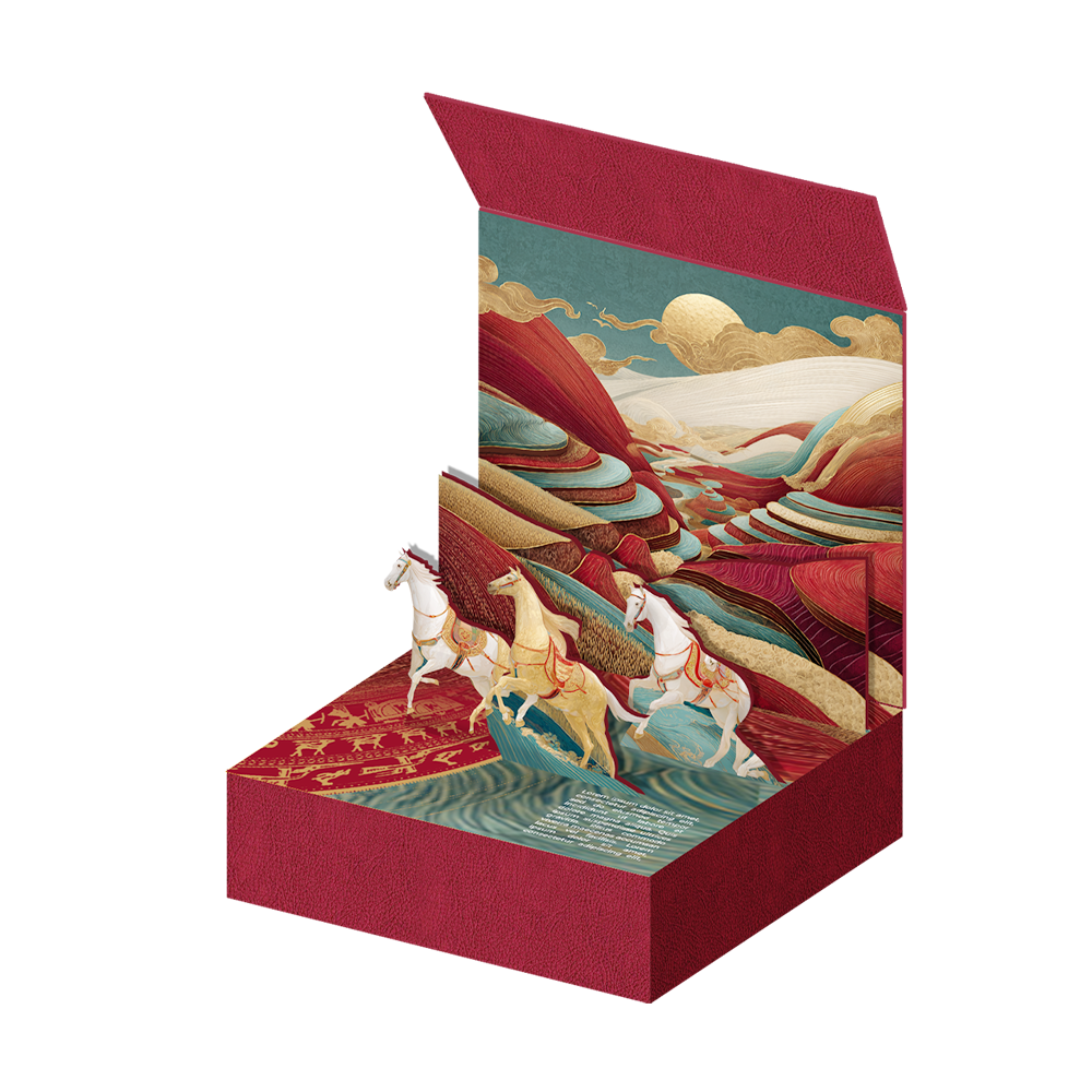
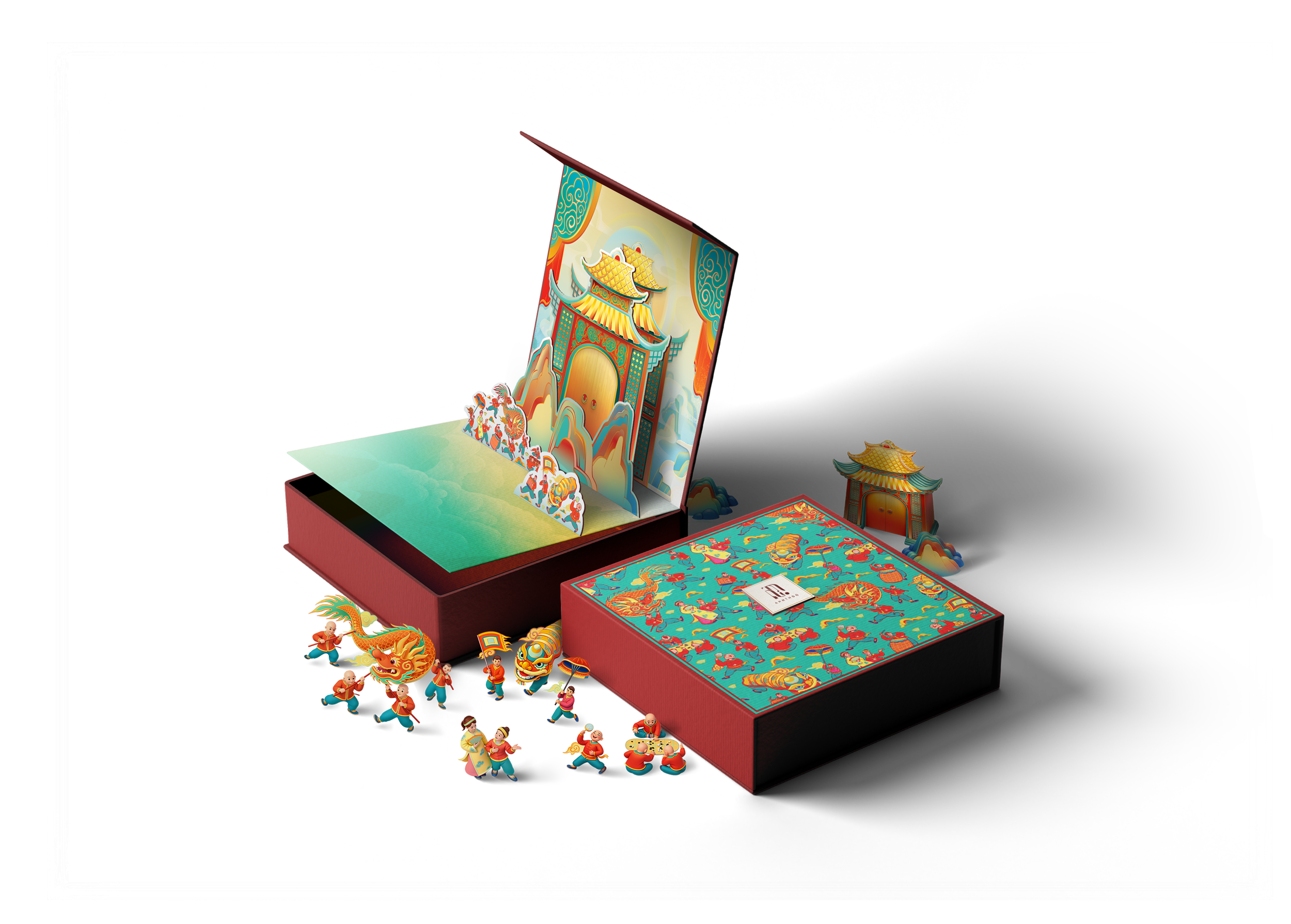
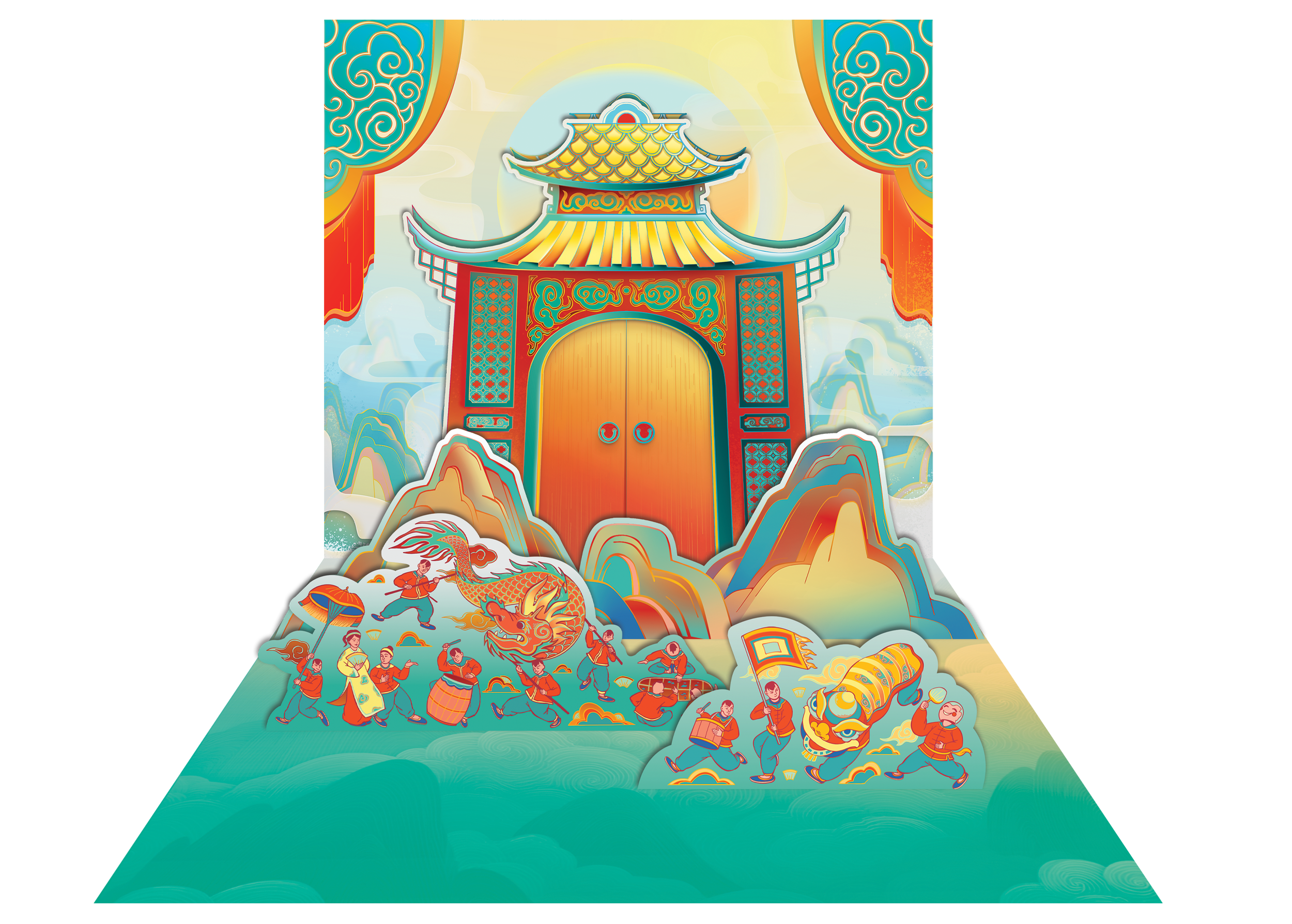
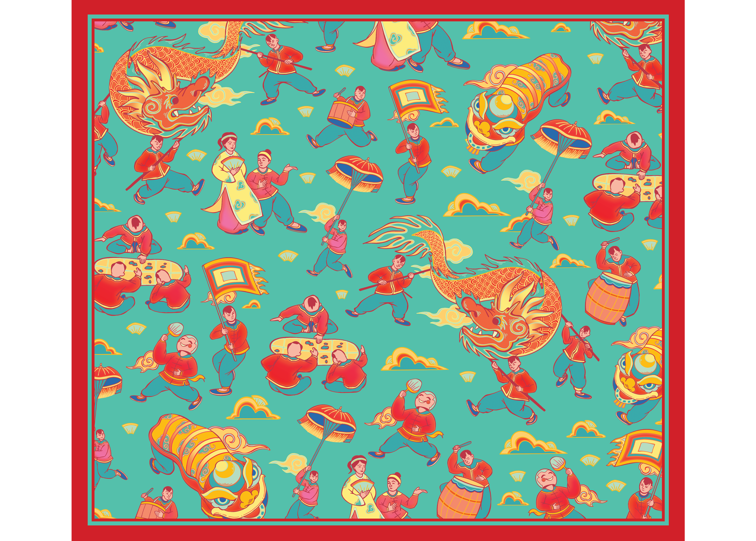
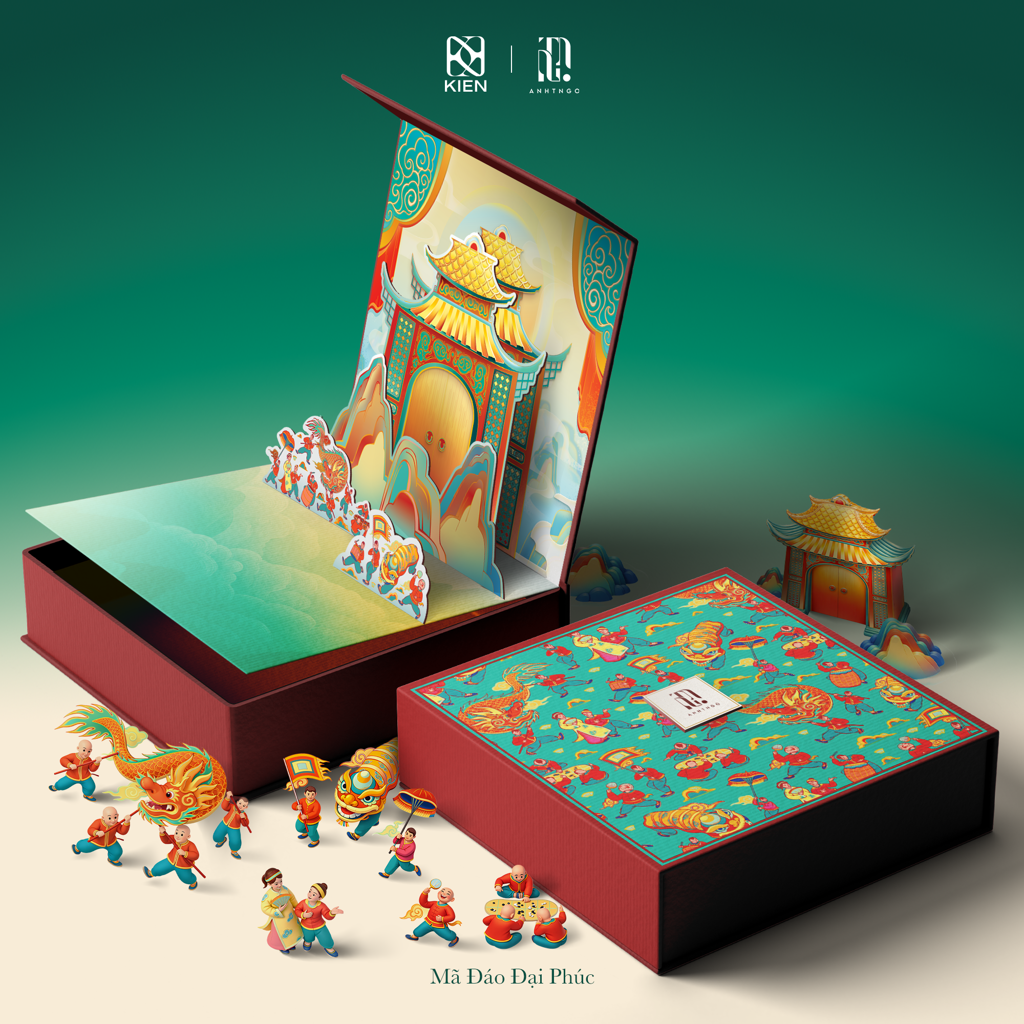
Mã Đáo Đại Phúc
Mã Đáo Đại Phúc is inspired by traditional Chinese paintings portraying clusters of children in lively celebration, a historic symbol of multiplying blessings, prosperity, and overflowing joy. The abundance of figures represents not just happiness, but happiness amplified, shared, and passed through generations.
This sense of fullness is translated into a layered pop up structure, where numerous characters and festive details unfold in a vibrant scene. The density of elements creates energy and movement, transforming the unboxing into a moment of collective joy. More children, more laughter, more life. A visual expression of Đại Phúc in its most abundant form.
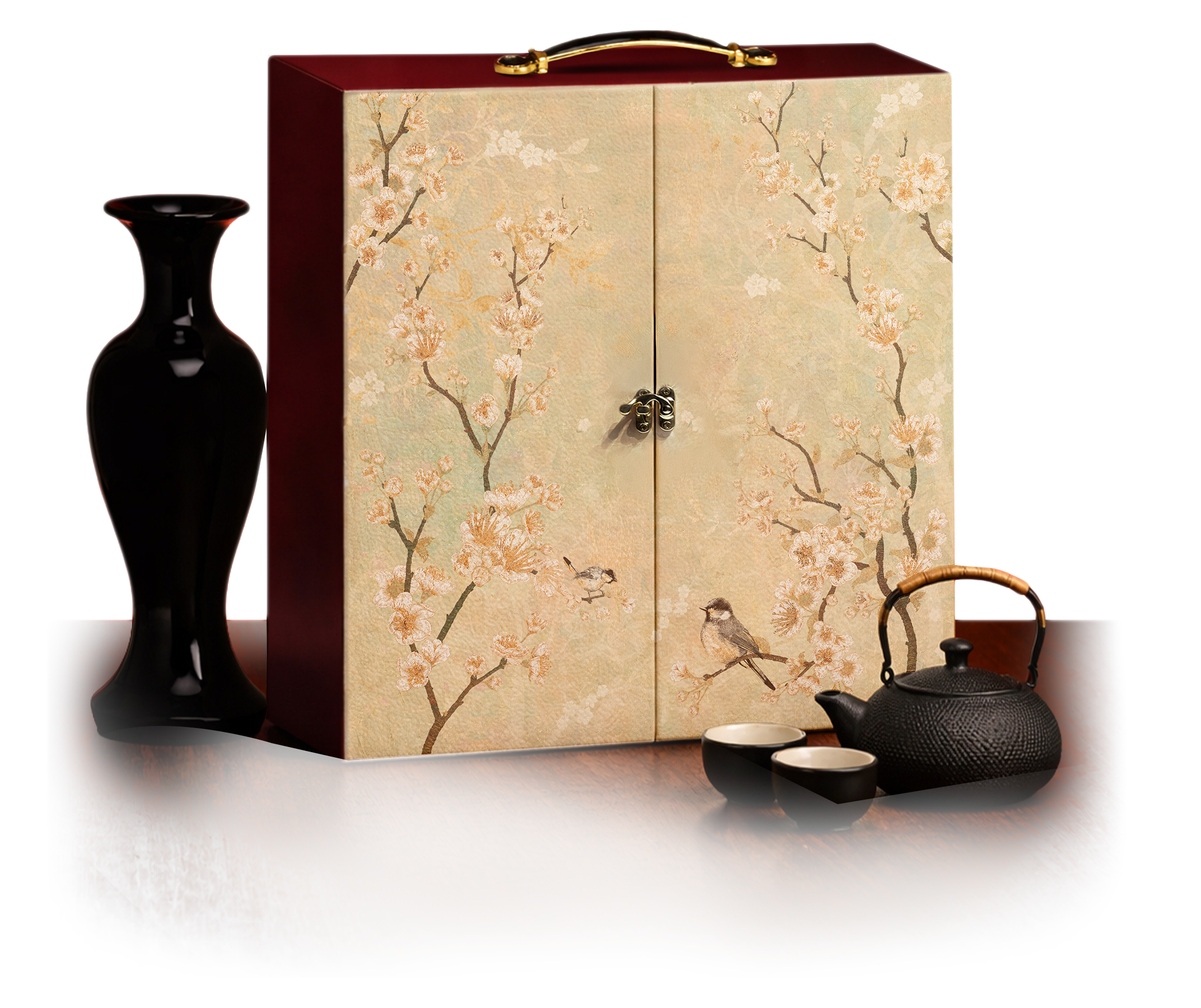
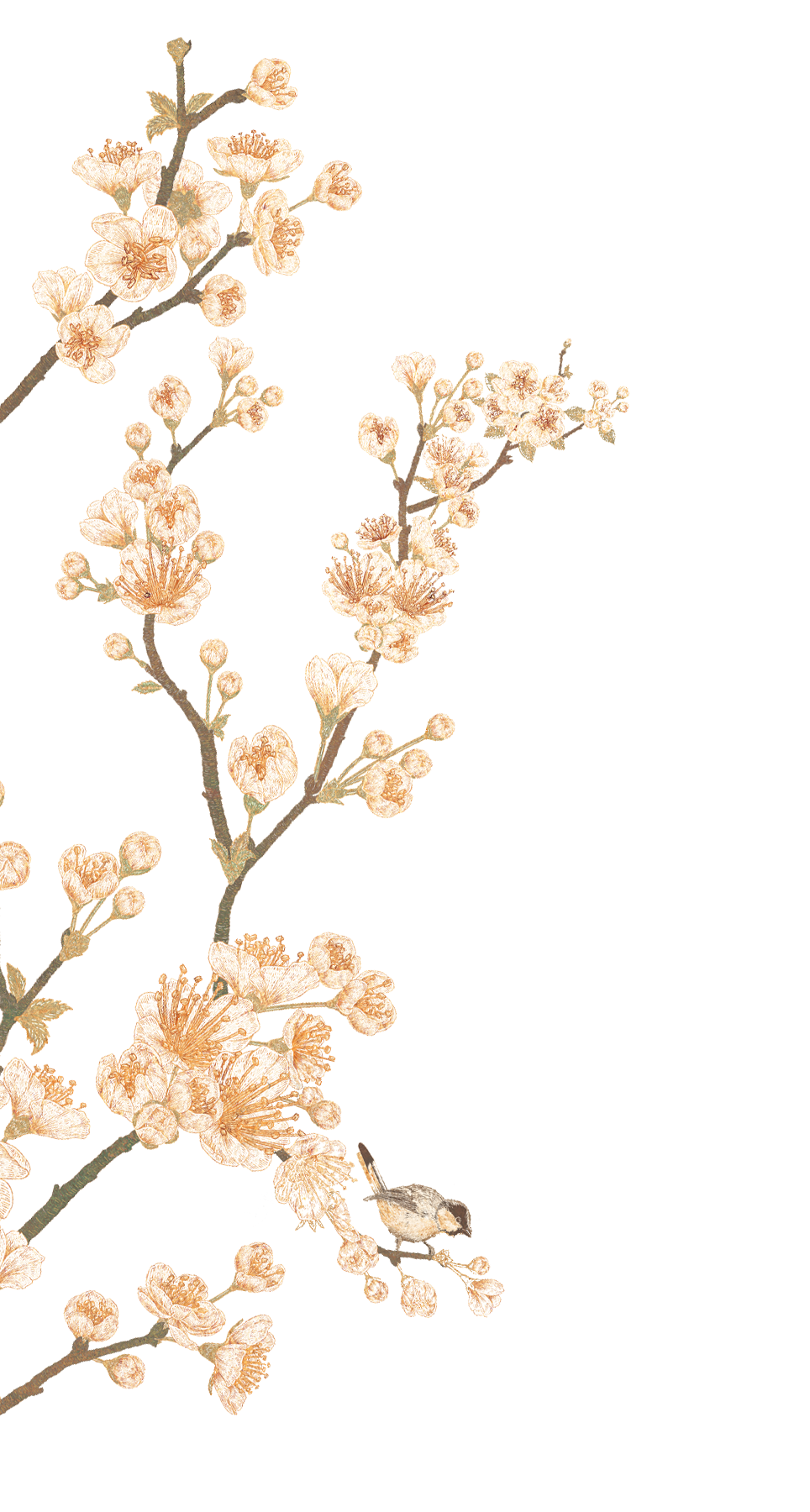
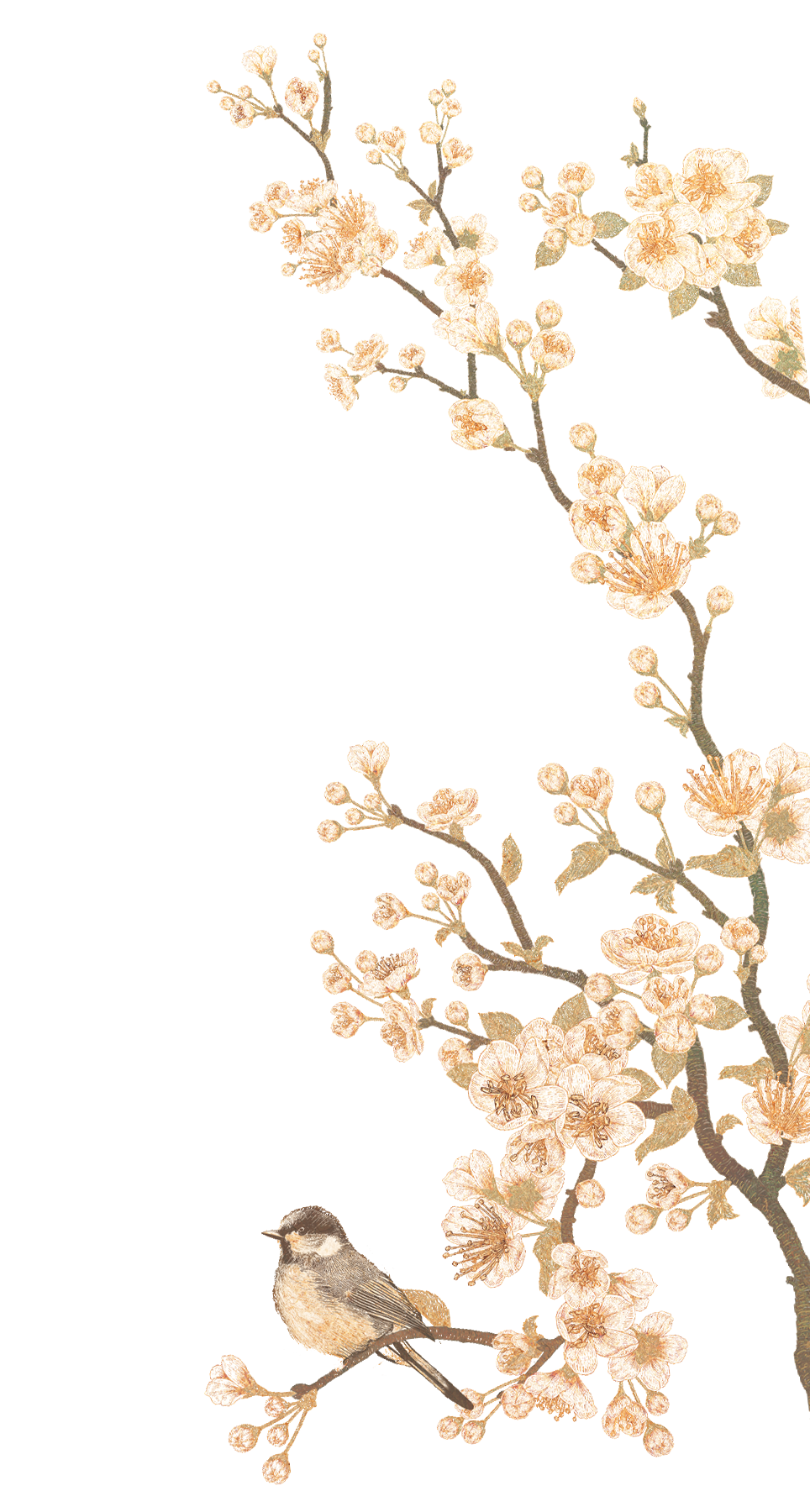
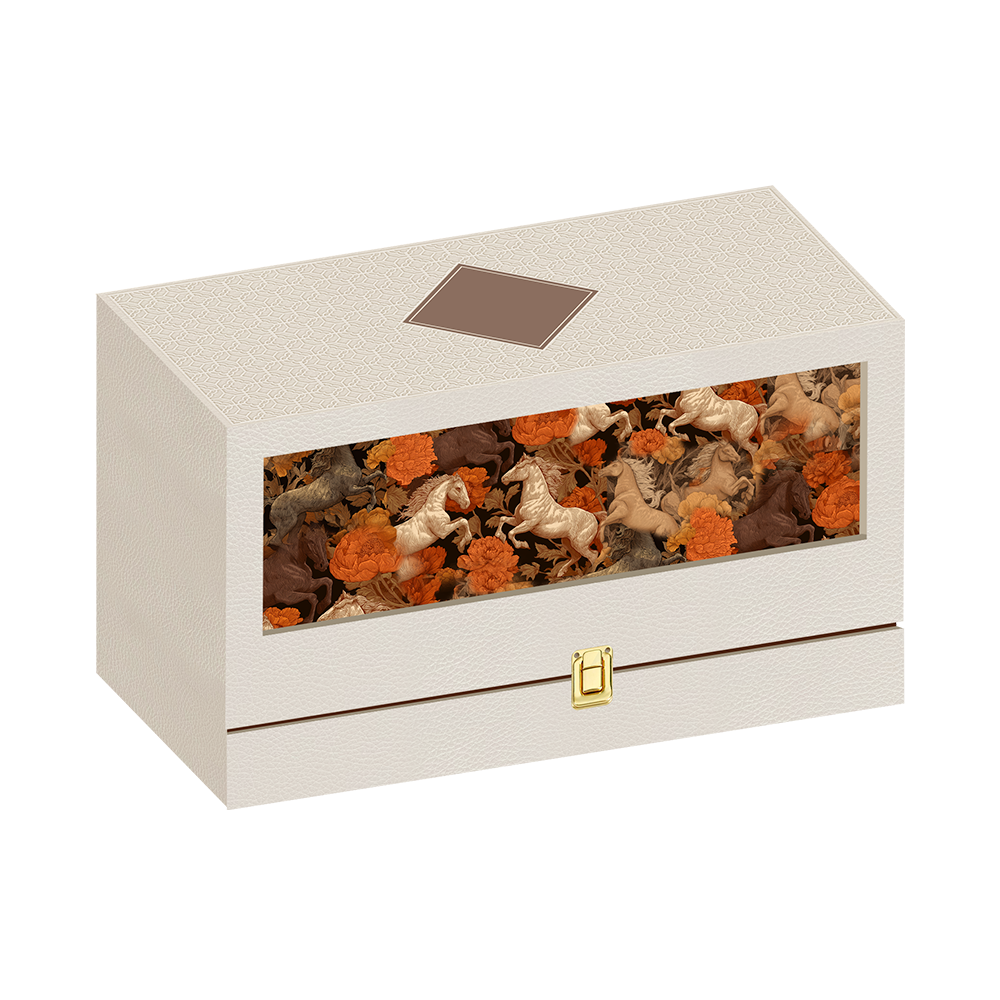
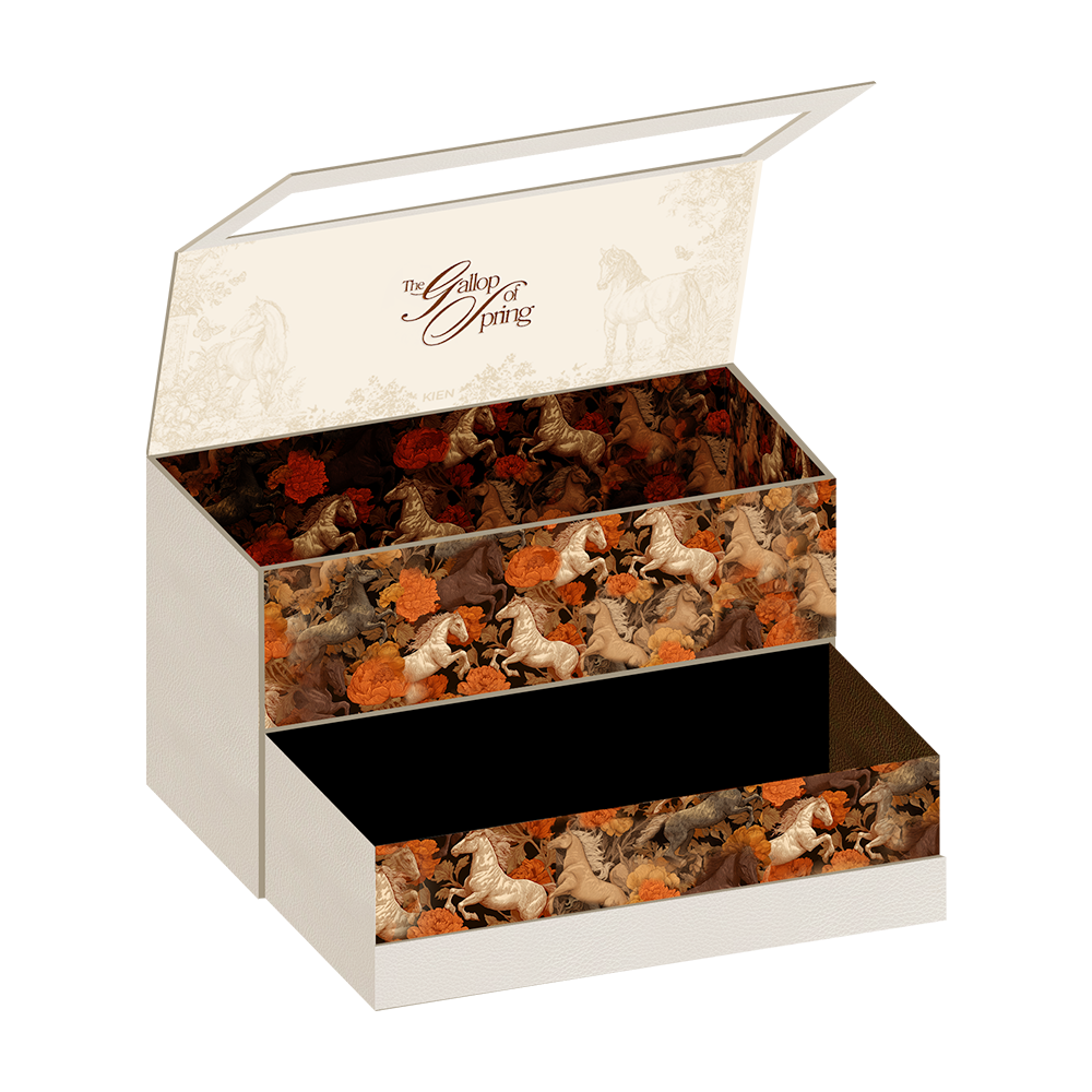
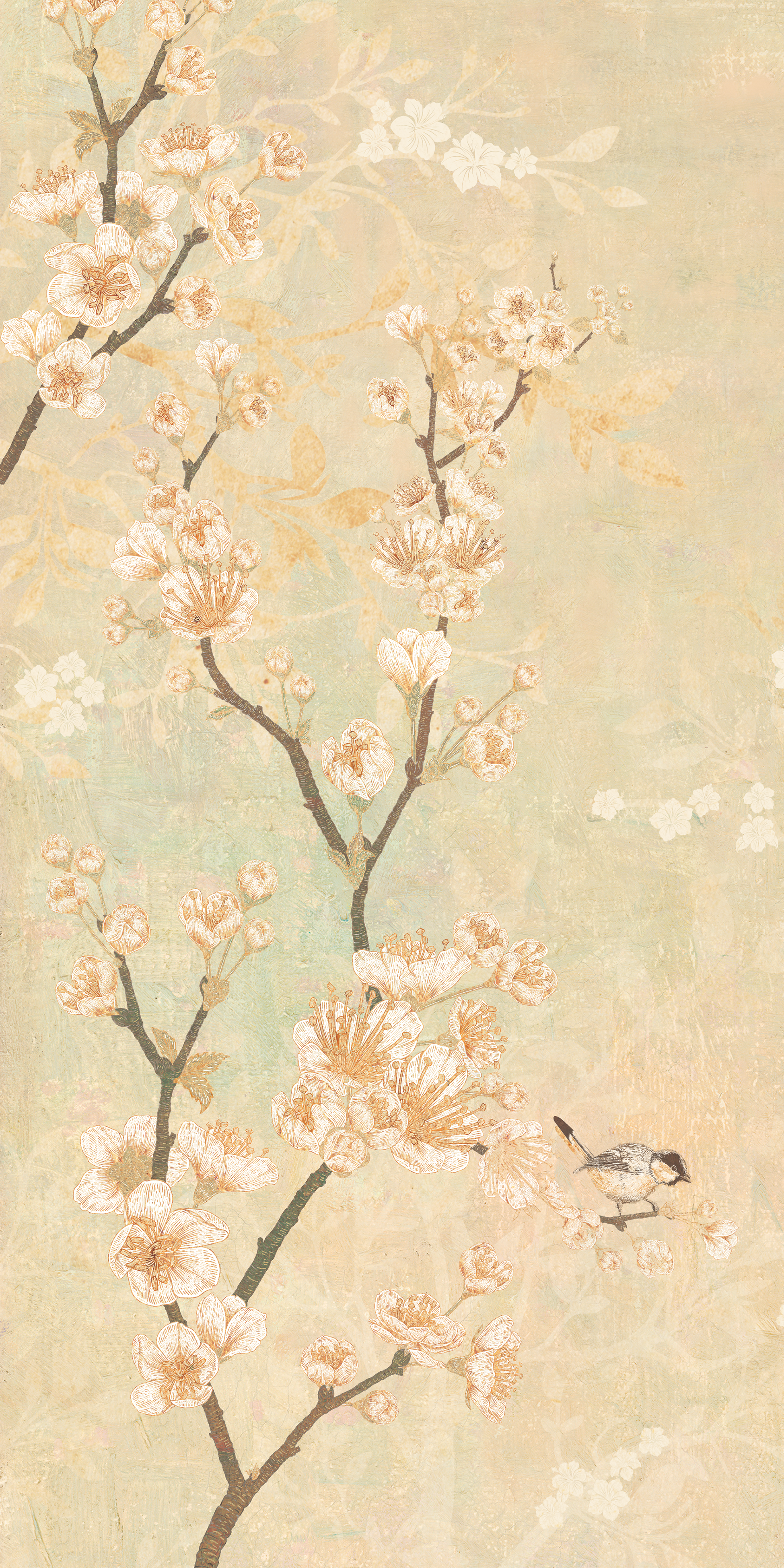
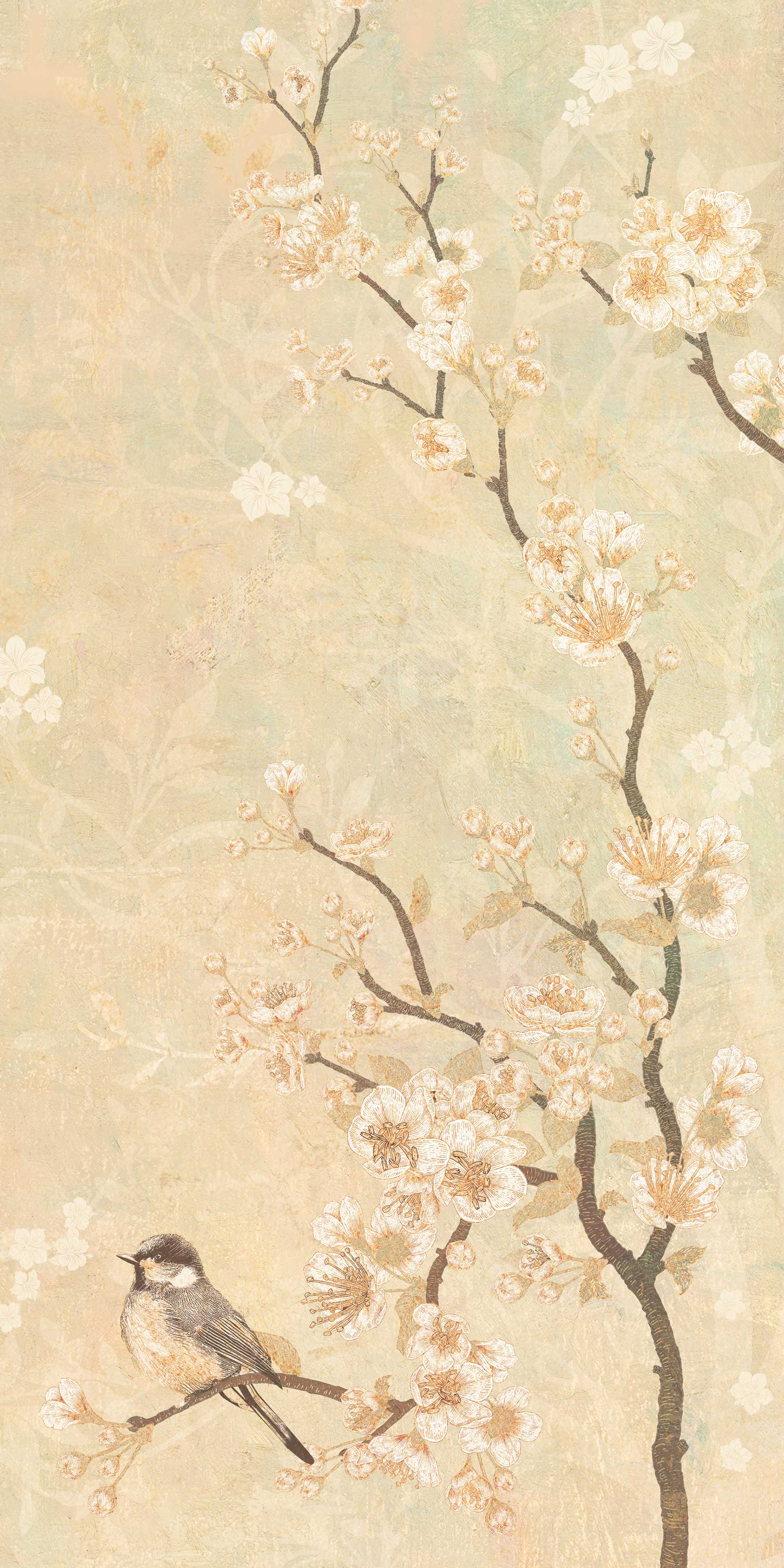
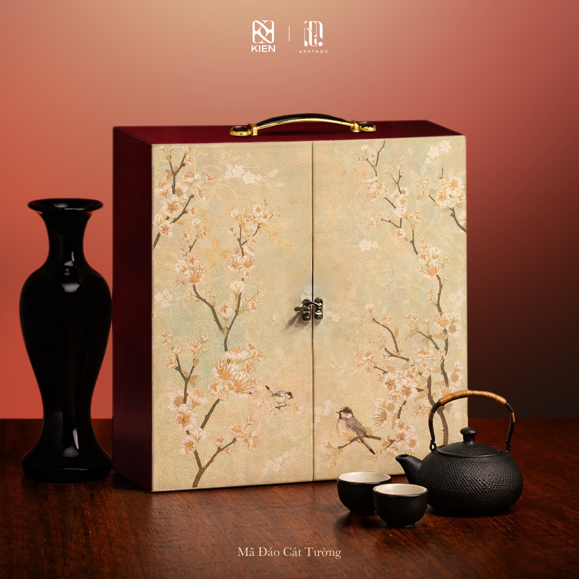
Mã Đáo Cát Tường
Mã Đáo Cát Tường is conceived as the most poetic expression of the collection. Centered on the theme of love and harmony, the artwork features a pair of birds, a classical symbol of devotion and lasting companionship.
The composition embraces restraint and balance, allowing delicate blossoms and refined textures to breathe within generous negative space. Here, the spirit of Mã Đáo is not expressed through dynamism, but through quiet assurance and graceful presence.
Subtle yet resonant, Mã Đáo Cát Tường speaks of prosperity intertwined with affection, honoring not only success, but the enduring bonds that give life meaning.

Client: KIEN | Project Manager/ Art Director: Ngô Tuấn Anh | Lead Artists: Vũ Thắng Văn, Kỳ Quá Ta, Ngô Tuấn Anh
Support Artist Hạt Dẻ Cười | 3D Render and Mock-up: Ngô Tuấn Anh | Special Thanks: chị Thảo, chị Kim, anh Nguyễn Thành Lam, em Lương Minh Thư, và các nhà máy sản xuất