Tenderine’s core value is “The power of rest”. They focus on feminine products that take care of your body, and your mental health. This project consists of 2 main parts.
Tenderine’s brand Identity
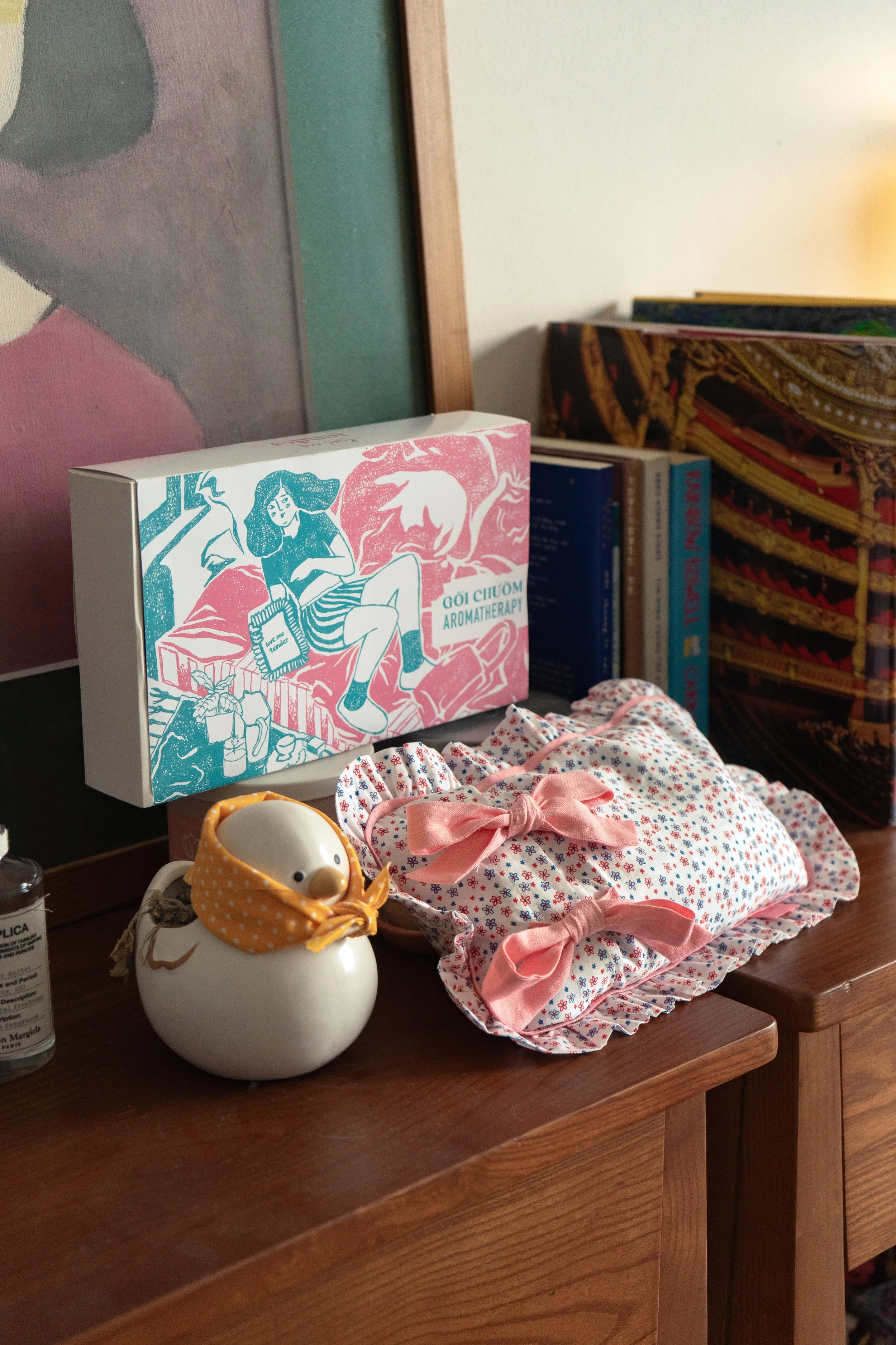
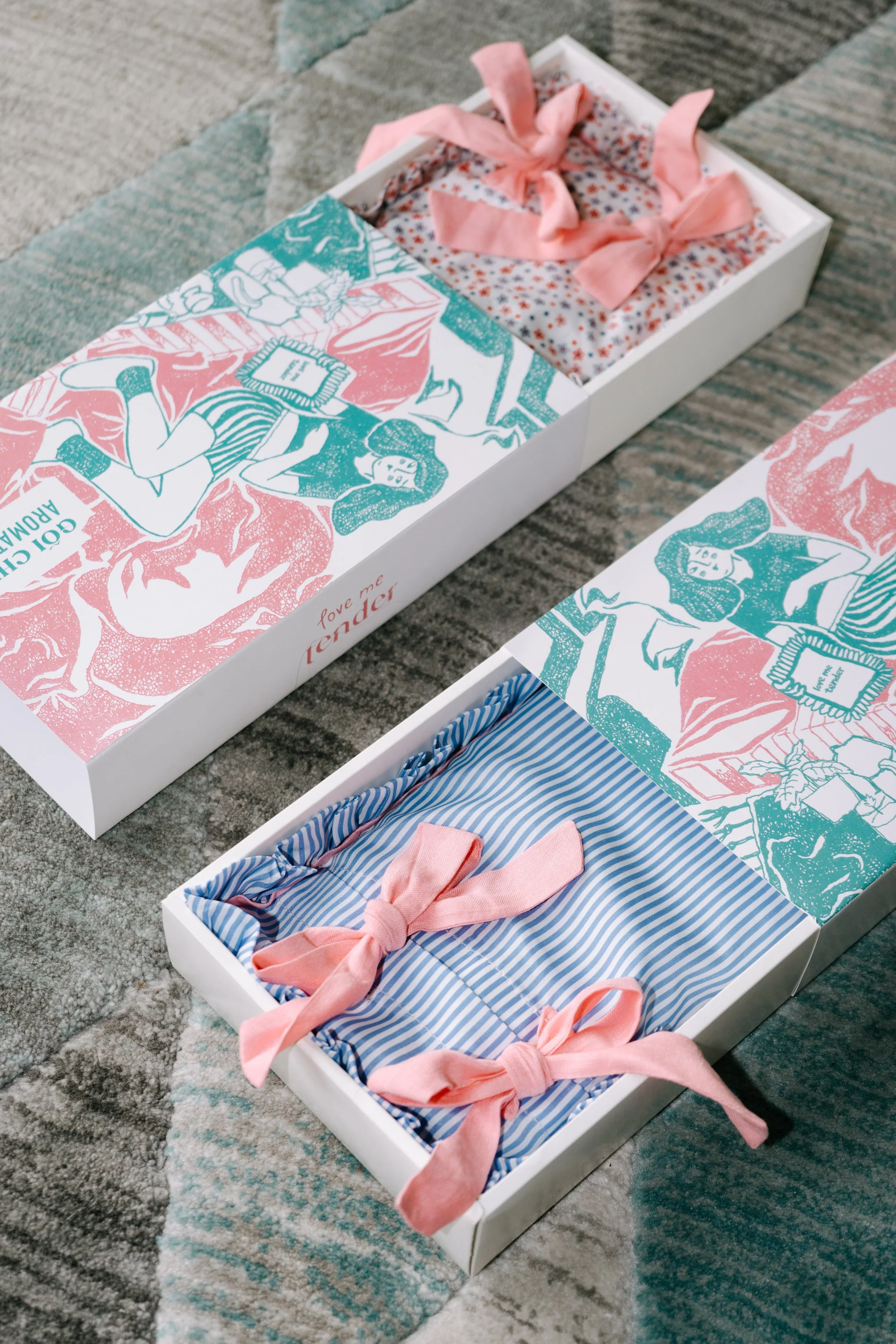
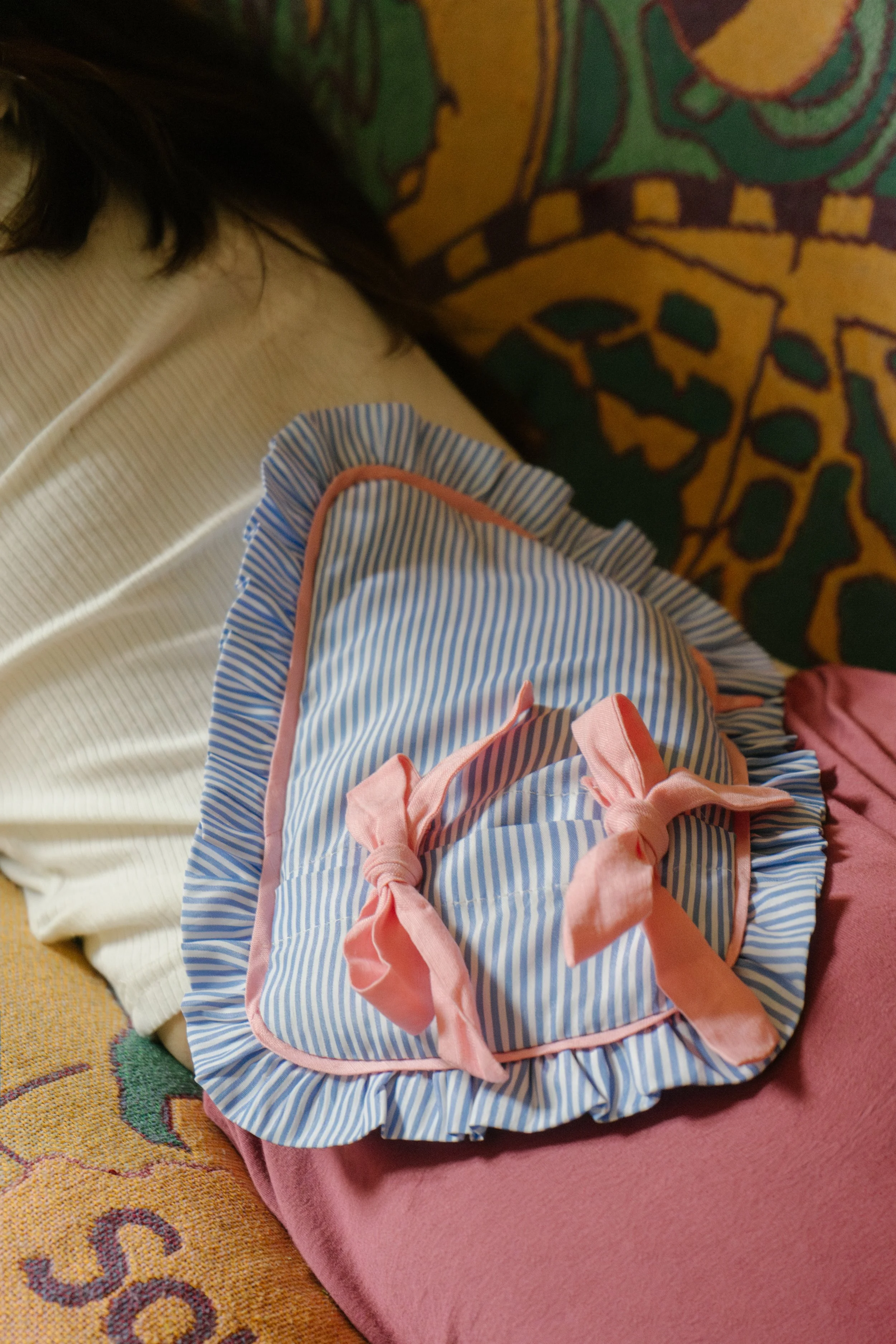
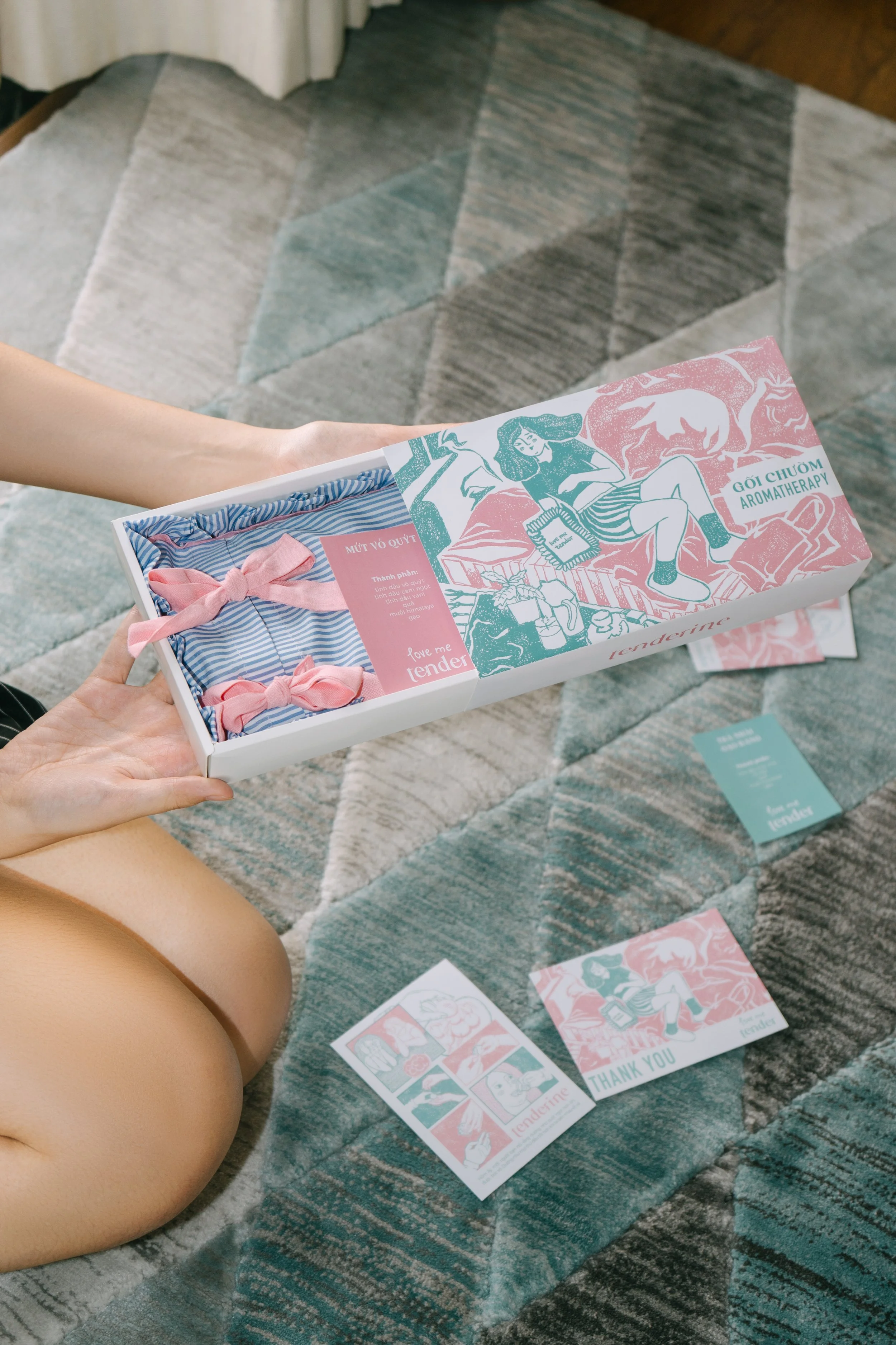
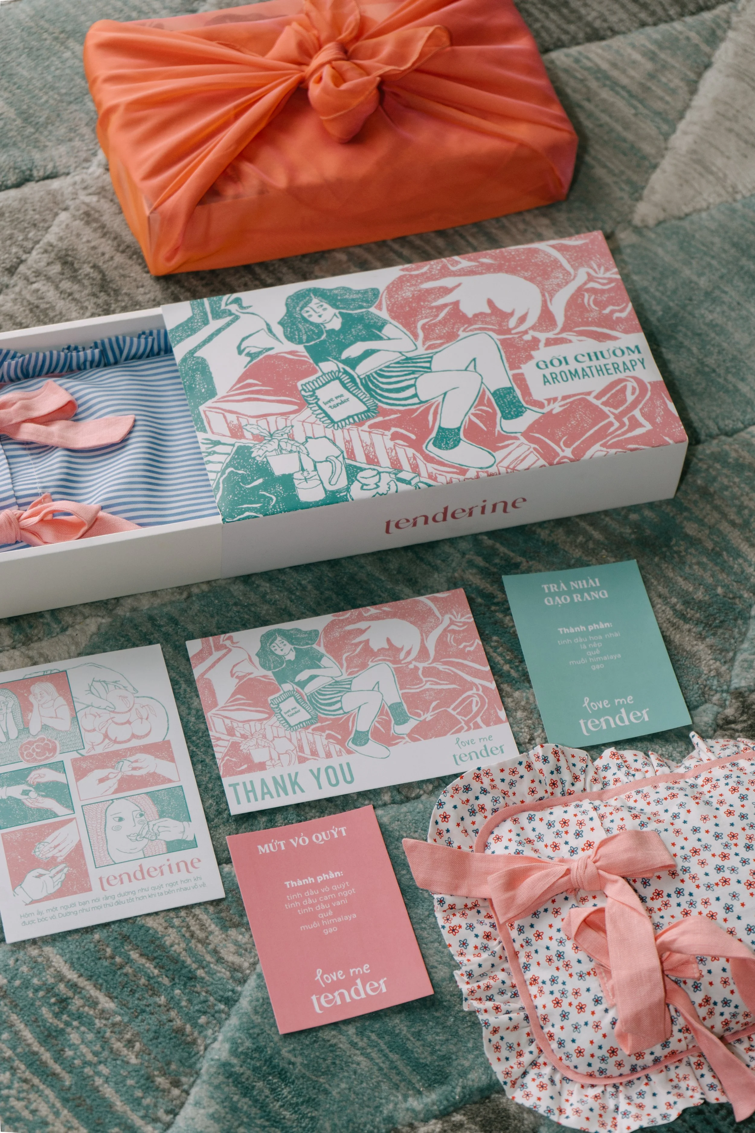
2 package designs of 2 different aromatherapy pillows
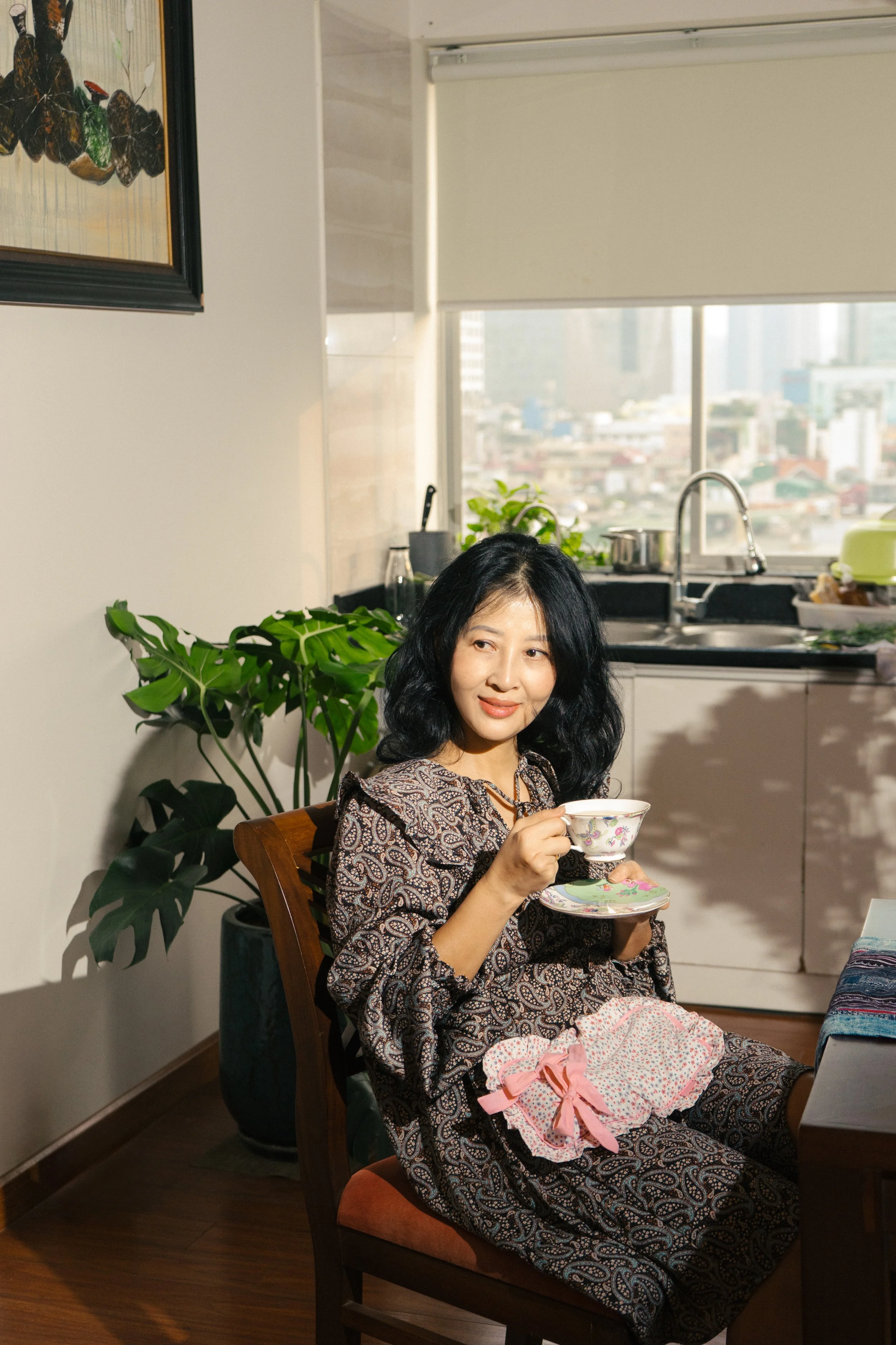
Tenderine’s products are now available online through their fanpage, and physical at OHQUAO Store, Vietnam.
Branding Overview
Tenderine’s founder said “It’s a lovely afternoon when I was talking to one of my friend. We just had lunch and now sharing a bowl of tangerine. My friend hates tangerine, but she loves preparing it for me. She said “Everything taste better when you only have to be patient and relax”. Then she peeled one and gave it to me. Sharing is caring. Tenderine was formed that day. We cares about you, your physical and mental health.”

| the power of rest
| the power of rest
Brand’s logo

Campaign’s logo

Primary Typography: Elmond Font

Secondary Typography: DIN Condensed Bold

Content Typography: Source Sans Variable

Main color palette


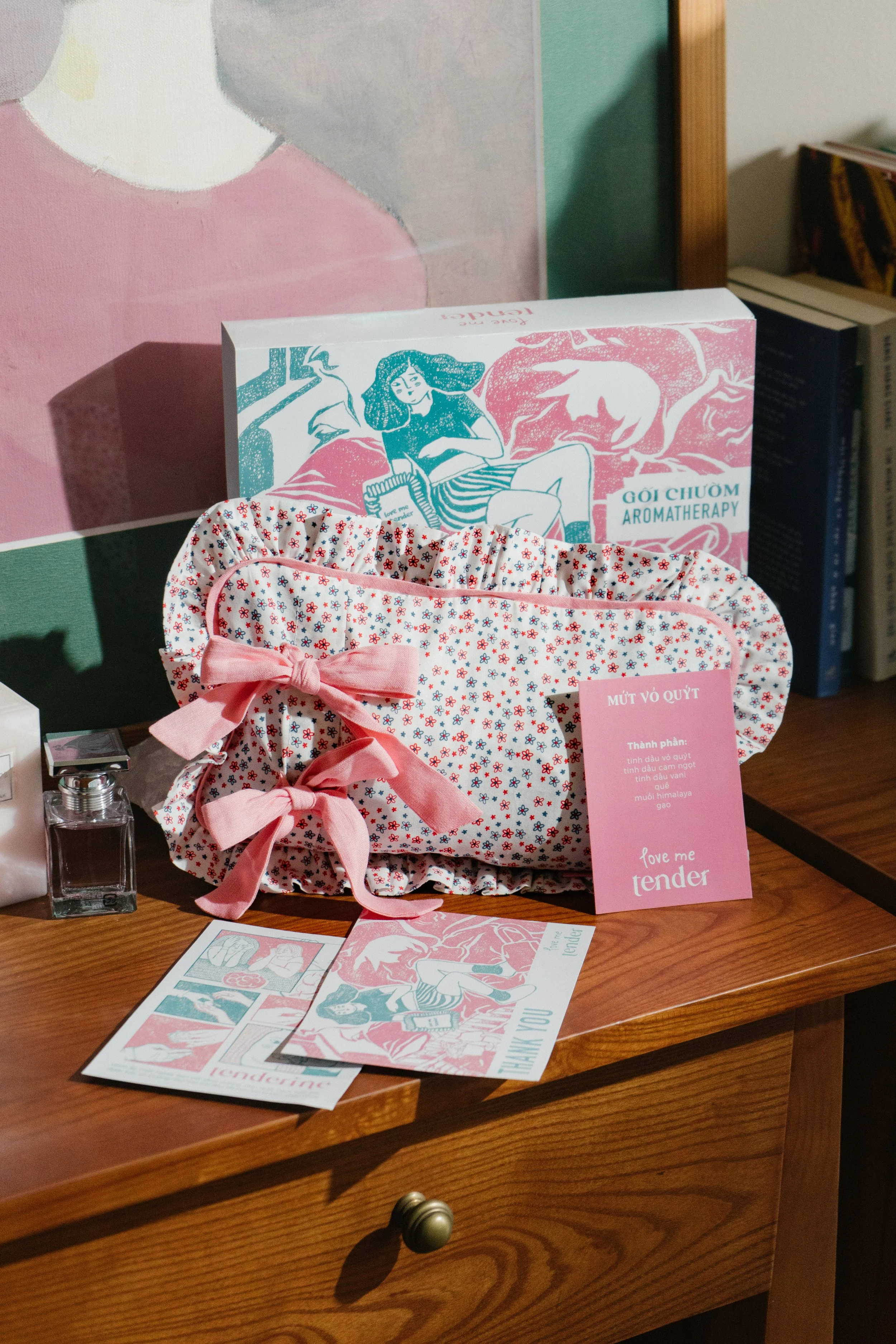
2. Package design
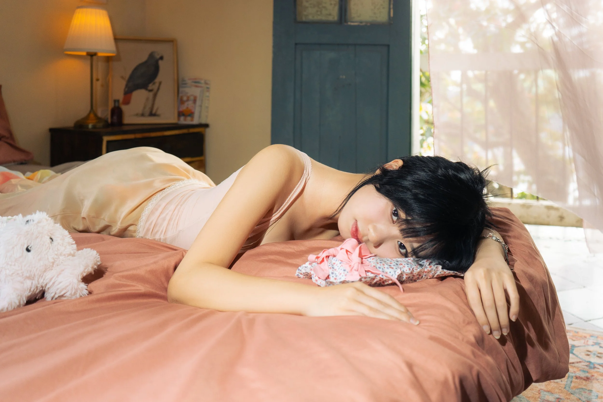
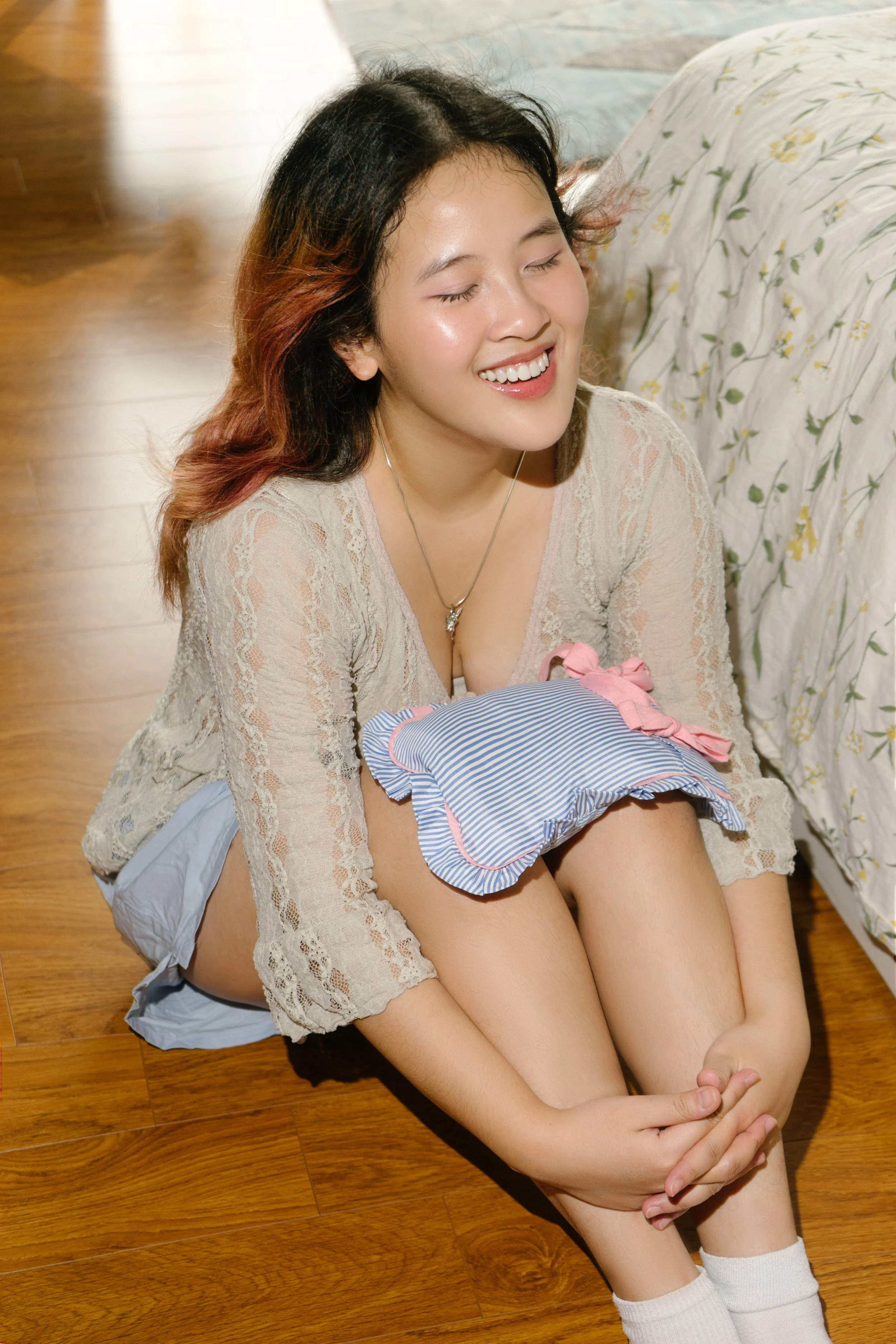
Tenderine’s targeted audience are women in their 20s. Therefore, they want to approach the design with fine line drawings, selected graphic elements that show feminine characteristics.


3. Graphic Breakdown
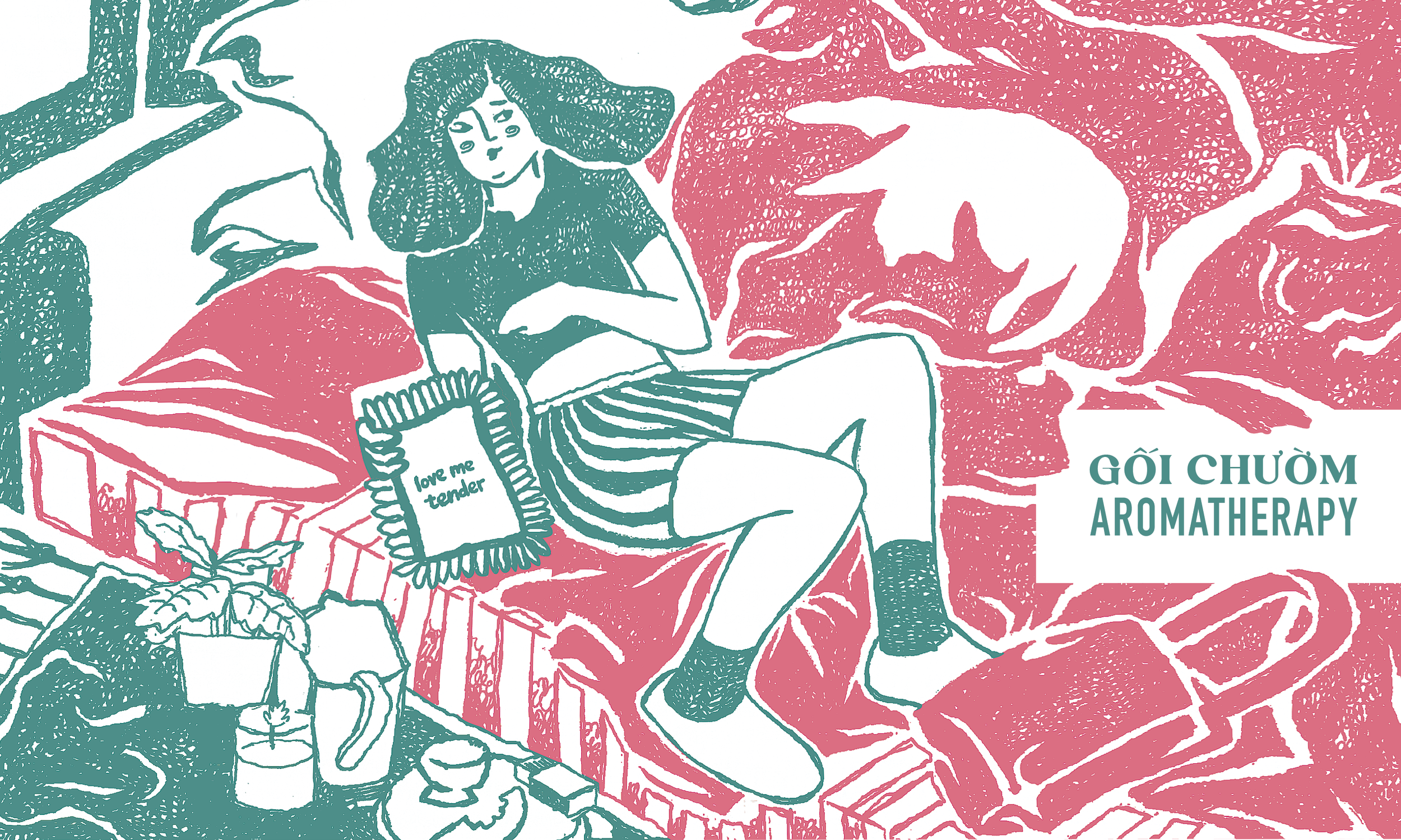
Outside Box Front:
This is a scanned-fine-art drawing of a women relaxing on the bed with her cat. She’s holding Tenderine’s product.

Outside Box Back:
This is a scanned-fine-art drawing of 3 core values of Tenderine’s first collection. Warm. Aroma. Solf.
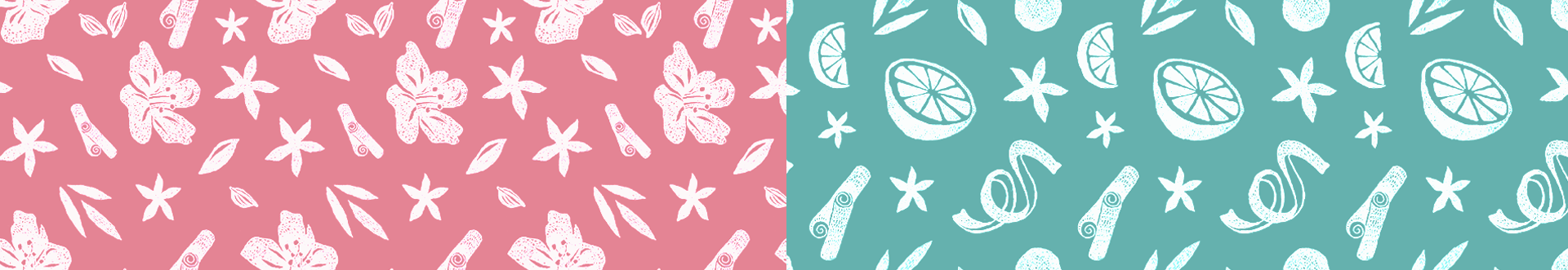

Ingredients for package 1
Ingredients for package 2

Tenderin Brand’s Story
〰️ LOVE ME TENDER
〰️ LOVE ME TENDER
Design Process
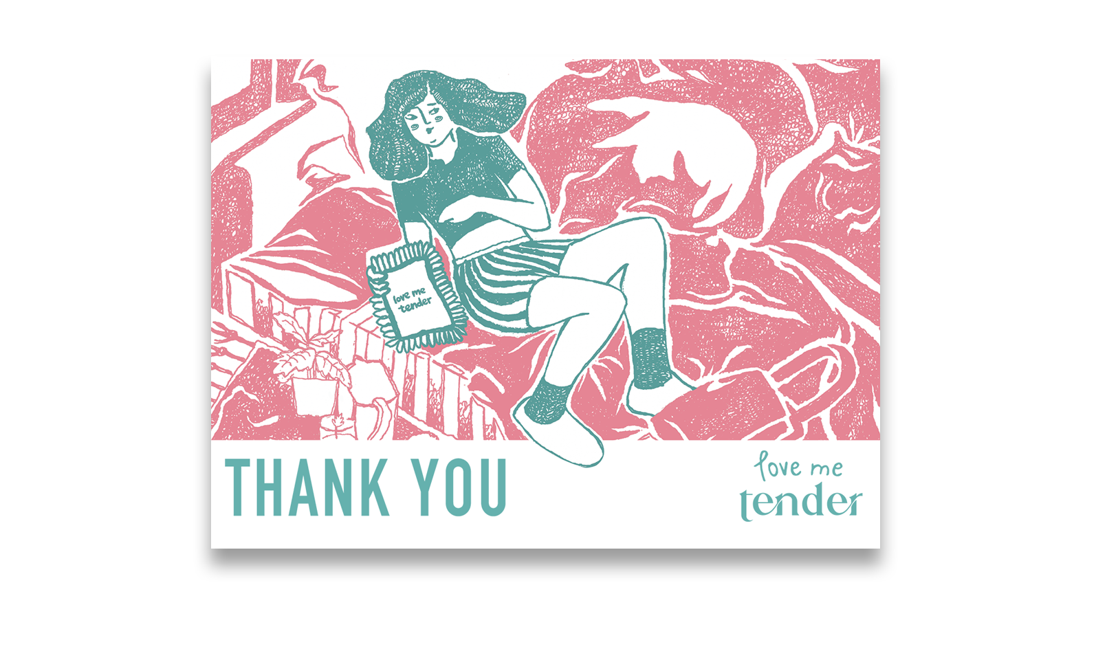
Thank-you-note front

Thank-you-note back